STEAM JUST CHANGED HOW PLAYERS SEE YOUR GAME (and most devs will miss this)
Introduction
Steam is currently testing a new homepage update. On the surface, it might look like a simple visual refresh, but it’s really much more than that. This update changes how players experience your game before they even click on it, and that has some pretty big implications for developers.
Let’s break it down.
1. What players now see before they click
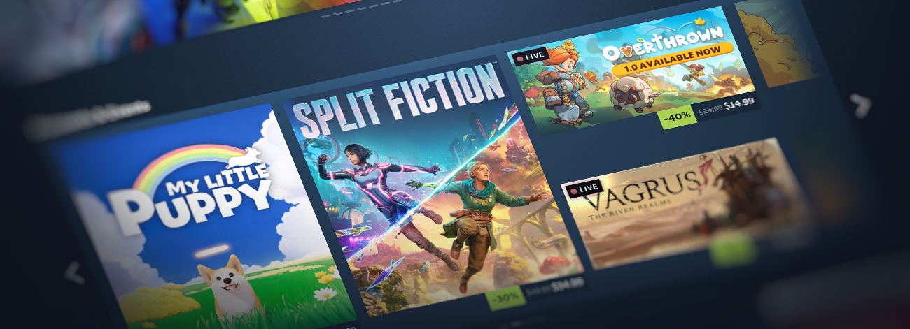
One of the biggest changes is how trailers are presented. When a player hovers over your game’s cover art, a micro trailer will now play instantly. This means players are no longer relying on your capsule image alone to decide whether to click. They are seeing your game in motion straight away, without any commitment. At the same time, Steam is showing a sneak peek of other games in the same row. So instead of looking at your game in isolation, players are now scanning others around it in real time. Review scores are surfaced more clearly as well, allowing players to quickly see how well a game is received without needing to interact with it first. That’s a very different experience from what we had before.
There are changes to how games are presented in other areas of the store, too. Discounts and events now use larger artwork, which puts even more emphasis on how your game looks at a glance. Steam is providing more detailed information on why a game is being recommended, giving players additional context before they decide to engage. A new “Your Wishlist” section has been introduced, further demonstrating Steam’s effort to guide players through more personalised discovery.

2. Your game is being judged earlier than ever
So what does all of this actually mean? In my opinion, it comes down to one key change. Your game is now being judged earlier than ever before. Previously, getting a click was a big step. It meant the player was at least interested enough to open your page and learn more. Now, a lot of that decision-making is happening before the click even happens. Players are hovering, scanning, and making decisions very quickly. If your game doesn’t stand out in that moment, they move on.
This puts a lot more pressure on your first impression. Your trailer is no longer just something that sits on your store page. It is now part of the homepage browsing experience itself. It’s also worth understanding how these micro trailers actually work. They are not just the first few seconds from the start of your trailer. Steam automatically pulls short clips from different parts of your video to create a quick preview. That means players could be shown almost any moment from your trailer. If your trailer takes too long to get going, or only shows the best parts later on, there is a good chance those moments will never be seen.
Your trailer needs to consistently show your game in a clear and engaging way throughout, not just at the start. The same applies to your capsule art. With larger visuals and more games on screen at the same time, clarity becomes even more important. Players are not analysing your game in detail, but they are making quick decisions based on what they see in a split second – so keep this in mind.
3. What I would focus on as a developer
If you are a developer, this is where I would focus. Think about what a player sees in the first couple of seconds. Is it immediately clear what your game is? Can someone understand the core idea without needing to read anything? Is your logo clear and easy to read at a glance? Does your capsule art stand out against Steam’s dark background, or does it get lost? Even small things like contrast, colour, or adding a subtle border can help it stand out more. Does your trailer show something interesting straight away, or does it take time to get going?
These small details matter a lot more in this kind of environment. I don’t think this is just a small UI update. It feels like a big change in how Steam is approaching discovery, and more importantly, how players are interacting with games on the platform. The developers who recognise this early and adapt to it will likely see better results. The ones who don’t may struggle to get the conversions they could be getting with a few improvements.
4. Quick summary of changes
- Micro trailers now play when hovering over a game’s capsule
- A sneak peek of adjacent games is shown within the same row
- More detailed information is displayed on why a game is recommended
- User review summaries are surfaced more clearly
- Discounts and events now use larger artwork
- A new “Your Wishlist” section has been added
- The homepage layout has been refreshed for a more consistent design
- Infinite scroll has been updated to better match the rest of the store
That’s it for now. Thanks for reading, and good luck out there!


